Brands across the world are recognizing packaging as one of the most crucial components of their brand image.
When you think about just how important a product’s packaging is for attracting consumers to pick up the product and then place it into their cart, it’s not hard to see why more and more brands are investing in their packaging.
Think about the last time you made a big purchase—whether it was a new dining set, a new pair of headphones, a record player, or a T.V. Did the packaging have any effect on your decision? Odds are, the answer is yes, even if you didn’t realize it.
Brands spend a lot of time crafting the perfect packaging for their products because they understand that sometimes they only have a split second to convince shoppers to choose their product over the competitors’ right next to it.
But what is the most essential part of your packaging? Is it the copy? The colors? The design? Perhaps even the shape?
The answer: all of them work together to create the perfect package that sells. But today, we’re going to talk about the last one—the shape, form, and functionality—and why it matters in the packaging world. This is known as structural design, which is a lot different than creative design.
The creative side of the packaging is all about which colors, images, and words should be used to create an engaging package that properly relays a concrete message. Meanwhile, the structural design of a package involves making the package functional and practical while still supporting the creative elements.
Why You Should Be Paying More Attention to Structural Packaging Design
Here are the ways in which your package’s structural design can positively impact the experience that your consumers have with your product.
Increased Functionality
If your packaging in and of itself is part of the product (i.e. ketchup bottles, toothpaste tubes/bottles, milk cartons), then improving the functionality plays a huge role in the quality of the product.
There are tons of great examples of brands that get this right. For instance, one of the more popular mass-produced cookie brands—Oreo—is a favorite of families across the U.S., and not just for their creme-filled desserts. Their functional packaging makes it easy to take a few cookies out and safely seal the packaging up so that the leftovers stay fresh.
Within the pharmaceutical industry, you’d be hard-pressed to find packaging that isn’t extremely functional—which is a key part of structural design. After all, when it comes to drugs that people are using regularly, the packaging needs to be easy to use while still being extremely safe and secure.
Improved “Feel” Factor
When it comes to conveying a certain “feel” with a package, creative and structural design go hand-in-hand. For example, creatively, Apple has excelled with its modern, minimalism, and white finishing on their designs, which creates the simple, yet refined and innovative vibe one feels when looking at their packaging.
But, when it comes to the structural design, Apple is just as intentional. In an effort to invoke a sense of anticipation when opening their packaging, Apple is rumored to have invested in perfecting the suction of its packaging lids to get the timing just right to help build up anticipation.
Read more about Apple’s packaging and why so many brands are investing in their packaging design now more than ever here.
Another brand that nails the feel factor is eos and their egg-shaped lip balm. Seemingly transforming the entire chapstick industry overnight, eos is a favorite lip balm option, particularly among young women. Instead of the cylinder tube one expects with lip balm (that inevitably gets lost), eos offers their consumers an experience when they use their lip balm. Not only does the shape affect the experience, but different flavors have distinct colors, allowing consumers to express themselves by choosing colors they like. This once again illustrates the close connection between structural and creative design.
Jonathan Teller, one of the cofounders of eos, summarised their thought process on the packaging design in a recent interview:
“For us, the aspect of packaging design has to be aesthetically pleasing but also, in order for it to be successful, there has to be an element of an improved function to the product we’re developing so that it’s a holistic experience for the consumer,” says Teller. The “improved function” Teller is alluding to is the shape, which the brand believes provides more functional application than the traditional cylinder-shaped lip balms.
As a result of the packaging, the brand—which is less than 15 years old—has already captured nearly 5% of the lip balm/treatment market in the United States.
Easier Transportation
Versatility in terms of transportation and being able to take products on-the-go is another big factor when it comes to the structure of a package.
A great example is Yoplait Go-Gurt, which completely transformed the kid’s yogurt market. Similar to eos, Yoplait turned the market on its head by addressing a fundamental need within this industry: that yogurt needed to be transportable for school lunches and snacks on the go. The structural packaging of Gogurt made it easy to take yogurt on-the-go without needing to bring a spoon.
Simplified or Unique Shelving
Another way in which the structural design of your packaging can impact your brand is that it can help make your product stand out.
Take Patagonia’s hexagonal baselayer packaging. As noted in this case study, the goal of the packaging was to create a dynamic at-shelf presence, capturing consumers’ attention and matching the quality of the product inside.
In addition, the packaging was intended to lend itself to some fantastic in-store displays, particularly aimed at third-party retailers. Overall, the new package fits Patagonia’s current customers’ views while attracting new consumers, as well as decreasing the carbon footprint of the packaging process and bringing brand awareness in-store.
This is a great example of how altering your structural packaging design can help bring more consumers to pick up your product from the shelf, which ultimately influences a purchase.
Stand Out On the Shelf
With a lot of the past examples, you’ll notice that the packaging has helped separate brands from their competitors. After all, this is the end goal of packaging—to persuade shoppers to notice your product, not the ones next to it.
If you’re interested in reading about structural design and other trends, check out this 2020 Packaging Trends e-book.
Structural Packaging Design Solutions For Your Brand
Are you interested in providing your packaging design team with the tools and solutions they need to improve the structural design of your packaging?
Here are two exceptional tools for doing just that.
ArtiosCAD
Increase productivity with the world’s most popular structural design software for packaging design, ArtiosCAD.
ArtiosCAD allows you to simplify the process of creating structurally sound, elaborate, and challenging designs. With this solution, you’re only limited by your imagination for design.
The easy to use software handles all the important metrics for you, allowing you to perfectly fit your package around any imported 3D CAD product model.
ArtiosCAD also saves hours of design work by easily turning custom designs into design templates, which you can then seamlessly add to your library.
WebCenter
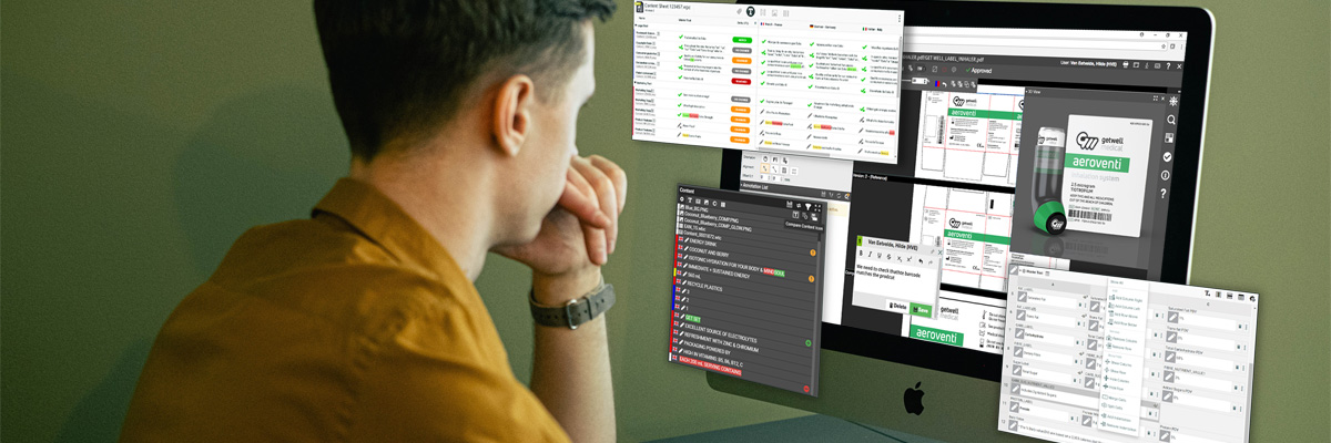
Manage and store your entire packaging process from creation to distribution through a single source with WebCenter.
WebCenter can help in the following ways:
- Specification
- New requests and tasks can be initiated much faster and are less likely to be overlooked by the employees that are assigned them.
- Search & Reports
- WebCenter allows you to drastically improve your risk management, as well as gain valuable insight into potential bottlenecks that are slowing down operations.
- Process Management
- This solution can reduce your lead time by 50% in packaging creation, all while utilizing half of the resources.
- Approvals
- No one likes it when projects get held up because they can’t get approved. WebCenter remedies this problem by making approval cycles three times faster, as well as reducing revisions by 60%.
To learn more about ArtiosCAD and WebCenter, contact Esko today!

